Bit O' Luck Case Study
ux resarch and design, marketing content strategy
Bit O’ Luck is a website for an equine rescue in Huntersville, NC. I redesigned the site to increase the number of donations. I focused on optimizing content and adding better call to actions on the homepage.
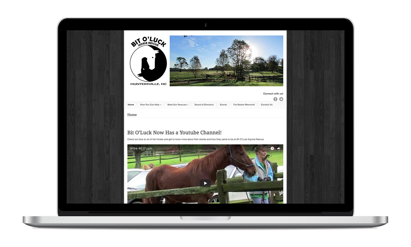
When I first started, the website focused heavily on text content. The “donate” buttons were hard to find and weren’t bold enough to persuade visitors to click on them.
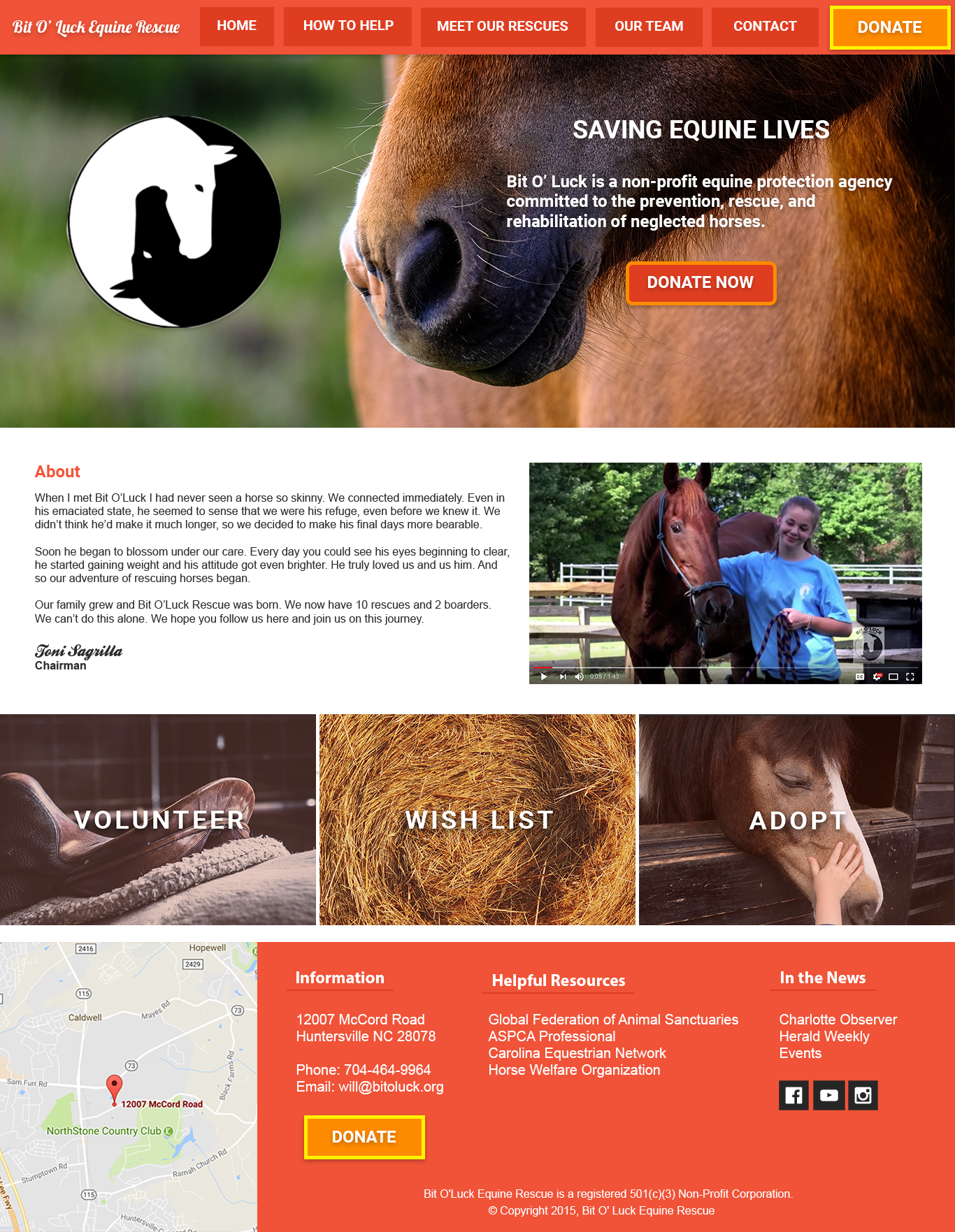
With the help of a team of volunteers, I worked to redesign the website - both content and visuals. We wanted to shift the focus away from the background information (the what) to the reason behind the rescue and it’s mission (the why).
Process
I started off by meeting with a volunteer of the organization who worked closely with the owners. We discussed the mission of the organization and what the priorities for the website were.
I then researched competitor sites. We ultimately wanted to answer: “Why do visitors come to a horse rescue website? Is it for informational purposes or to take action?”. We also wanted to compare the current design against the competitors to see how it stacked up.
With my team, I leveraged the research to inform the design. I narrowed down elements from the competitor sites that were most effective. We decided what features were missing from the website, how to pare down the content to the most impactful copy, and how to add more visual interest to the donate buttons.
We removed extra copy that didn’t add value to the content and restructured the page to emphasize the mission of the organization.. It was important to create visual consistency with a new look and feel that was easy to use, but also distinctive. We wanted to make it easier for users to both find information and contribute (either their time, money, or ideally both).
What I learned
While my natural tendency is to want as little copy as possible, I realized that specific, mission driven copy is important and very powerful for a website that relies on pulling a user’s emotional heartstrings. I also learned that if there are two sides to a cause, users generally seem to respond better to the positive side. Highlighting the benefits of horse rescue rather than the horrors yielded happier users, and happier users are more likely to donate or volunteer.
Although we ran into platform compatibility issues in the end and were never able to launch this re-design, it was a learning great experience.